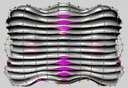
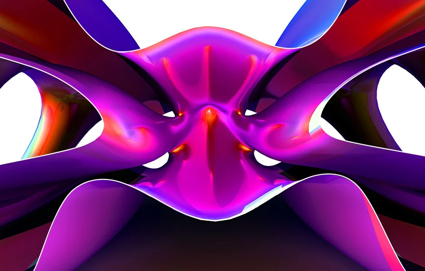
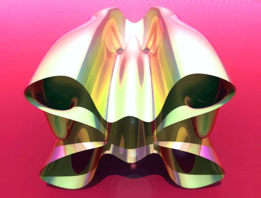
Searching for something in my email I came across this amazing drawing done by Noah Olmsted, my partner in XV. If I remember correctly, this was made back when we were in studio with Jeff Kipnis and Greg Lynn at Columbia.
Jeff Kipnis Presents Coop Himmelblau
My former teacher / spritual adviser Jeff Kipnis has curated this retrospective of the work of Coop Himmelblau:
COOP HIMMELB(L)AU
BEYOND THE BLUE
Thu, Apr 2 - Sun, July 26, 2009
Wexner Center Galleries
The innovative approach of COOP HIMMELB(L)AU permeates buildings, ideas about urban planning, and even the name of this influential Viennese architectural firm.
“Coop” signals the firm’s identity as a cooperative. “Himmelb(l)au” offers the double meanings of “sky blue” (with the “l”) and “sky building” (without). Launched in May 1968, COOP HIMMELB(L)AU has never yielded the radical fervor of its founding moment and consistently rejected preconceived notions of design across 40 years of exquisite, experimental plans and constructions. Among its recent projects are the double cone structure of the new BMW center (BMW Welt) in Munich, the eye-catching addition to the Akron Art Museum, and the dramatic headquarters for the European Central Bank in Frankfurt.
The Wexner Center is proud to host the U.S. debut of this exhibition from MAK in Vienna, one of the world’s leading museums of contemporary art and design. In it, you’ll have the opportunity to study several projects in depth in large-scale models and to survey small models of many more projects displayed on an oversize model table. Recalling an urban landscape plan, this display strategy evokes the firm’s belief in architecture’s need to address spatial possibilities, while also reflecting design principal Wolf Prix’s passionate critique of contemporary urban planning. Choreographed light and film sequences add to the rich visual experience. Jeffrey Kipnis, professor of architecture at Ohio State, is the exhibition’s consulting curator.
Organized by MAK—Austrian Museum of Applied Arts / Contemporary Art, Vienna.
Graphic Section
I love this graphic building section done by my friend Noah Olmsted for our Jeff Kipnis + Greg Lynn studio.
Greg Lynn + Jeff Kipnis Final Review
Front Elevation
Rear Elevation
These are the rendered elevations I showed in the final review of our studio with Jeff Kipnis and Greg Lynn. Somehow I lost the rest my drawings in the sleepless hours and inevitable computer crashing.
I've been to many great reviews, and this was by far the best I've ever witnessed. The presentation was very minimal, one plan, one section, two renderings and a model, and this led to interesting comparisons between projects and an incredible discussion.
There was a prolonged argument about the "cod piece" rear entry of my proposal which was judged to fulfill the new architectural effects we were after. Personally I’m more interested in the simulated reflections along the rear protrusions, as was Kipnis, but overall I was really happy with the feedback I got and mostly satisfied with my work.
Opacity and Refraction
I’m trying to figure out how to generate a combination of simulated and real reflections and at the same time produce surface depth. This image shows the interior skin of my project as it stands now. These channels (based on my fat studies) will be chromed and sit behind a curved glass skin, hopefully creating a double mirror effect.
Fat House
I had no idea that this is where I was going with my studio project, but at the moment I’m exploring the concept of fat within architecture. I’m trying to figure out how to produce a kind of cherub eroticism as opposed to something streamlined. Clearly the eroticism part is not there yet.
Nesting Forms and Fishnet Structure
Nested Forms
Fishnet Structure
I'm working on two complimentary strategies at the moment, nesting forms and fishnet structural systems. The idea is to produce more of a sensual relationship between the forms and then to wrap them with a revealing exoskeleton.
Form Study Refined
Orchid
More work for my Greg Lynn + Jeff Kipnis Studio...
Forms and Bodies and Colors
I’m trying to figure out some formal strategies for the house I am designing for the Greg Lynn + Jeff Kipnis studio I'm taking. At the moment I’m still fishing but there’s something about these that is working for me.
Bloody Hearts
I'm in a design studio taught by Greg Lynn and Jeff Kipnis this semester and this is my first little bit of work. See the brief of the studio here. So far it's amazing.


