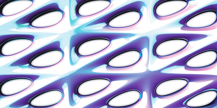
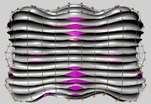
These proofsheets show various configurations of our chandelier during assembly.
Cloud Forest
A truly bizarre world of potentially affective refractions and bulbous forms.
Final, Final Review
Here is the opening slide for my final, final review. Only 14 more to go...
Component 1
This is the first finished component of the chandelier I am designing with David Boira and Zoe Coombes. Only 31 more to make...
The Underbelly
This is where I imagine some of the seedier folks of London hanging around. It's kind of a cliche of how bridges are used, but seediness is one of the elements I was interested in preserving when re-conceiving the bridge.
Atmospheric Landscapes
The organization of this atmospheric landscape is based on dynamic simulations of flocking behavior that is injected with attractors to particular ideological flows. Essentially there is a desire in the flock to find certain organizations and to move in certain directions as influenced by a set of variables that consider ideas of site, agenda, space, and programmatic performance.
Flow Path Plan
This is still sort of a sketchy plan, but the idea is to produce a landscape that replaces the functions of a bridge while adding a slew of programmatic opportunities.
Advanced Curtain Walls
I’ve been taking Advanced Curtain Walls with facade guru and super cool guy, Robert Heintges. My project is an attempt to produce an obsessively flush yet ornamental facade, a play on the recent graphic obsession with the Rococo and the Modernist history of the curtain wall. It's also a play on materials (and expense) as its made from inlaid polished nickel plate, black oak, and eight foot diameter silicon mounted glass.
Pseudo Science
These are the opening stills from my midterm
presentation at the AA in London. I’m playing around with an idea of
pseudo science, both as a joke and as an excuse to use a 1950's textbook graphic style (as influenced by Damien Hirst's most recent publication).
Diagonal Mesh Topology
Albedo Study 02
Another light study on a more complex surface. The refractive capacity of the surface is getting to a pretty interesting point via the variation in the component organization.
Albedo Study 01
This animation shows the effect of light as it moves across the surfaces I'm developing.
DPMA High Resolution
Here are some better renderings of the high-refraction surfaces I'm developing.
DMPA Assembly
These diagrams show the minimal surface components I'm developing attaching via edge to edge connections.
Disruption Pattern Material via Albedo (DPMA)
I’m working towards a geometry that maximizes refraction and albedo to the point that it is subsumed by its own effects. This is the first surface experiment that seems to be getting close to what I’m after. Its based loosely on the connection technique of the Schwartz H surface and optimized based on techniques that maximize albedo and reflection.
Minimal Surfaces
Schwarz H Surface via Jotero
I’ve started the semester looking at three diverse spatial and organizational ideas, disruption pattern materials ( camouflage ), emergent behaviors, and minimal surfaces. You can learn more about minimal surfaces here. I’m really interested in how minimal surfaces allow for complex geometries with seamless edge to edge connections and am looking to explore this in concert with some ideas I’ve been working with on other types of topological systems.
Graphic Language
We just had an informal review of our work so far this semester. I won't go into what this is all about, but I can tell you that it did not go over well.
Greg Lynn + Jeff Kipnis Final Review
Front Elevation
Rear Elevation
These are the rendered elevations I showed in the final review of our studio with Jeff Kipnis and Greg Lynn. Somehow I lost the rest my drawings in the sleepless hours and inevitable computer crashing.
I've been to many great reviews, and this was by far the best I've ever witnessed. The presentation was very minimal, one plan, one section, two renderings and a model, and this led to interesting comparisons between projects and an incredible discussion.
There was a prolonged argument about the "cod piece" rear entry of my proposal which was judged to fulfill the new architectural effects we were after. Personally I’m more interested in the simulated reflections along the rear protrusions, as was Kipnis, but overall I was really happy with the feedback I got and mostly satisfied with my work.
Opacity and Refraction
I’m trying to figure out how to generate a combination of simulated and real reflections and at the same time produce surface depth. This image shows the interior skin of my project as it stands now. These channels (based on my fat studies) will be chromed and sit behind a curved glass skin, hopefully creating a double mirror effect.
Fat House
I had no idea that this is where I was going with my studio project, but at the moment I’m exploring the concept of fat within architecture. I’m trying to figure out how to produce a kind of cherub eroticism as opposed to something streamlined. Clearly the eroticism part is not there yet.


