I've been wanting to make an animated gif and this is my first pass. The images were scanned from a Learn To Breakdance poster that I found in the sleeve of an old record in my collection. If it looks familiar it's because I used the same images years ago when learning flash (or because you have the same poster on your wall).
Random Holes
Bureau V Website
I just finished the site design for Bureau V. Its sort of a modulating atmosphere based mostly on the work I was doing earlier on interactive atmospherics. Using random color sets and blurs, cloud formations fade in and out of existence. Each time the site opens a new organization appears and can be regenerated endlessly by pressing the space bar. I’ve also set it up so that the user can modify the design, either by dragging the orbs around or by deleting them by pressing shift and clicking on them. There’s no content yet, that’s the next step.
Early XV
Here's another discovery made while searching through my hard drive… This is some of the earliest work Noah Olmsted and I did as XV. It was kind of a technique / mood driven research project / art piece. It has its moments.
Fluffy
This animation is proof that I have a problem with doing the work that I’m actually supposed to be doing, Looking for some unrelated files on an old drive, I stumbled onto these images from the first XV animation. Originally tests for a larger project, they are re-edited here into a short flash loop.
Spash Beta 2
Here's another (lighter) splash idea, currently running on the Bureau V welcome page
Splash Beta
This is a dynamic flash animation I’m working on for the Bureau V welcome page. Still very much in progress. Abandoned, too heavy.
Dynamic Font
Trying to get out some overdue work, I somehow stumbled into spending my day designing a dynamic font. It started out as something sort of LED inspired, then as I was playing around with making the coloration random I realized I could make each character fully interactive. Six hours later this is what I ended up with. Like everything else I guess its not quite done yet, but this is where I am for now…waves and such.
Dynamic Tiling
Random Numbers / Random Text
These are the byproducts of some experiments I’m doing in flash with randomization. Its nothing complicated, but kind of cool. The numbers are continuously random, while the text produces random organizations when you mouse over it. The file is embedded below if you want play around or edit. The random number code is quite elegant, but the text generator is pretty much a hack — I’m sure there is a better way but I haven’t had time to figure it out. Download the Flash file here.
Vintage VW
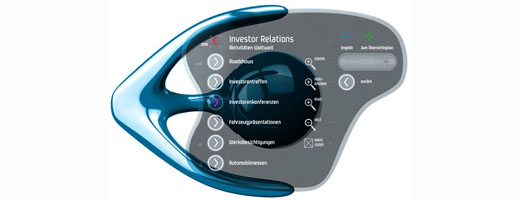
I finally got permission from Asymptote to publish some images of the haptic interfaces I designed for Volkswagen. These images have been laying dormant on my site for over a year, so you can either scroll back or just click here to have a look.
PROJECT / IMAGE CREDIT »
Asymptote Architecture: Hani Rashid and Lise Anne Couture
Self Designing Systems
Looking through my old files I came across this early version of my last website. It is missing all of the content, but it shows the performance pretty well. I was trying to make a site that could constantly redesign itself based on certain parameters. The hexagon, which is wildly overused these days, seemed like a nice way to add a geometrical component into a random organization algorithm. There are a lot of subtle features built in that make the interface rather sophisticated. If you scroll over the hexagons they scale in proximity to the mouse. Clicking a hexagon causes the colors of every other hexagon to fade into a randomly selected new color. The buttons on the darker hexagon eventually became the navigation system for the whole site, but for now they just regenerate the system (you can also do this by pressing space). My friend Alex Mollere who is getting his Phd. in Mathematics figured out that there are approximately 36,000,000,000,000,000 possible graphic layouts for this site not including shifts in color.
Skin + Bones: Parallel Practices in Fashion and Architecture
The animation I directed for Archi-Tectonics will be playing at MOCA in Los Angeles in the Skin + Bones exhibition beginning 11.19.06.
Breakin
I scanned a bunch of stills from a how to break dance poster I found in one of my old records to make this little animation. I’m using it as a placeholder on my website until I finish the new design. Given the way things are going lately that might be a while, so this will have to do for the time being.
PINC.US V1
These screenshots show variations of the original version of this website. The idea was to produce a site that constantly designed itself. Based on geometric relationships, randomization, and automated color selection, it produced billions of unique layouts, allowing chance to play a greater part in the design process.
Hemostology Website
I’ve just finished designing a webpage for the studio I taught with Hernan Diaz Alonso at Columbia. It’s a pretty simple page that tries not to compete too much with the work, but still keeps the feeling of what we were after in the course. Click here to visit.
More Spooky
More from the DJ Spooky + Chuck D video that never ends.
Dynamic Systems
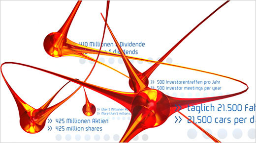
We have developed a dynamic advertising display for VW that presents company data in a morphing three dimensional network. The display is driven by dynamic forces in Maya, fed new data through Excel, and rendered in realtime, enabling endless combinations of form and information.
PROJECT / IMAGE CREDIT »
Asymptote Architecture: Hani Rashid and Lise Anne Couture
Touch Screen Interfaces
Some more work we’ve been developing for VW… These two scenarios show the graphics for vertical touch screen information kiosks that will be positioned throughout VW’s headquarters.
PROJECT / IMAGE CREDIT »
Asymptote Architecture: Hani Rashid and Lise Anne Couture
Navigator
These four screens control the navigation of the 3d interactive environment we've designed for Volkswagen's Autostadt.
PROJECT / IMAGE CREDIT »
Asymptote Architecture: Hani Rashid and Lise Anne Couture


