This is still sort of a sketchy plan, but the idea is to produce a landscape that replaces the functions of a bridge while adding a slew of programmatic opportunities.
Advanced Curtain Wall Renderings
Here are two renderings of the curtain wall project I'm developing with Robert Heintges.
Advanced Curtain Walls
I’ve been taking Advanced Curtain Walls with facade guru and super cool guy, Robert Heintges. My project is an attempt to produce an obsessively flush yet ornamental facade, a play on the recent graphic obsession with the Rococo and the Modernist history of the curtain wall. It's also a play on materials (and expense) as its made from inlaid polished nickel plate, black oak, and eight foot diameter silicon mounted glass.
Find the Closest Object
This is a useful MEL Script I just finished that Finds the Closest Object to any existing object in 3d space. Click on the link to download.
Me and Zaha
Oh, I'm just hanging with Zaha...
Pseudo Science
These are the opening stills from my midterm
presentation at the AA in London. I’m playing around with an idea of
pseudo science, both as a joke and as an excuse to use a 1950's textbook graphic style (as influenced by Damien Hirst's most recent publication).
Diagonal Mesh Topology
Albedo Study 02
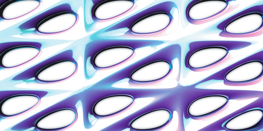
Another light study on a more complex surface. The refractive capacity of the surface is getting to a pretty interesting point via the variation in the component organization.
Albedo Study 01
This animation shows the effect of light as it moves across the surfaces I'm developing.
DPMA High Resolution
Here are some better renderings of the high-refraction surfaces I'm developing.
Calculate Distance
Here is a short MEL script that Calculates Distance between two objects in space. Click the link to download.
DMPA Assembly
These diagrams show the minimal surface components I'm developing attaching via edge to edge connections.
Disruption Pattern Material via Albedo (DPMA)
I’m working towards a geometry that maximizes refraction and albedo to the point that it is subsumed by its own effects. This is the first surface experiment that seems to be getting close to what I’m after. Its based loosely on the connection technique of the Schwartz H surface and optimized based on techniques that maximize albedo and reflection.
Minimal Surfaces
Schwarz H Surface via Jotero
I’ve started the semester looking at three diverse spatial and organizational ideas, disruption pattern materials ( camouflage ), emergent behaviors, and minimal surfaces. You can learn more about minimal surfaces here. I’m really interested in how minimal surfaces allow for complex geometries with seamless edge to edge connections and am looking to explore this in concert with some ideas I’ve been working with on other types of topological systems.
Graphic Language
We just had an informal review of our work so far this semester. I won't go into what this is all about, but I can tell you that it did not go over well.
Fleshology | Becoming Animal
Hernan Diaz Alonso, my studio critic from last year, has asked David Boira (my partner in the GSAPP housing studio) and I to TA for him this semester. Have a look at the studio brief and enjoy the Spanish to English translation:
Fleshology
“Becoming-Animal”
The Horrific and the Grotesque
Hernan Diaz-Alonso with Bryan Flaig
TAs: David Boira and Alex Pincus
A.01
This Studio, a belated exercise in Fleshlogy- “becoming-animal,” is not about the mimetic career of biology into and onto architecture, but of the transference of multiple physioiologic scales into the systemic intelligence of the involute surface-dwelling, and back again. The ocular nerve of the owl, the locomotion of the giant jellyfish, the pack logistics of the rat(s), the program of the frog, are not just forms, organic symmetries and baroque geometries. They are machines, they are solutions, partial grammars to take shape for us, and we for them.
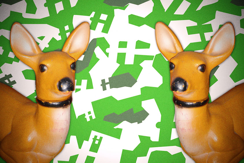
Double Deer Flash Graphic Camouflage
Here's something I'm playing around with. For what I don't know.
Me
Graphic Section
I love this graphic building section done by my friend Noah Olmsted for our Jeff Kipnis + Greg Lynn studio.
Greg Lynn + Jeff Kipnis Final Review
Front Elevation
Rear Elevation
These are the rendered elevations I showed in the final review of our studio with Jeff Kipnis and Greg Lynn. Somehow I lost the rest my drawings in the sleepless hours and inevitable computer crashing.
I've been to many great reviews, and this was by far the best I've ever witnessed. The presentation was very minimal, one plan, one section, two renderings and a model, and this led to interesting comparisons between projects and an incredible discussion.
There was a prolonged argument about the "cod piece" rear entry of my proposal which was judged to fulfill the new architectural effects we were after. Personally I’m more interested in the simulated reflections along the rear protrusions, as was Kipnis, but overall I was really happy with the feedback I got and mostly satisfied with my work.


