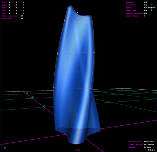
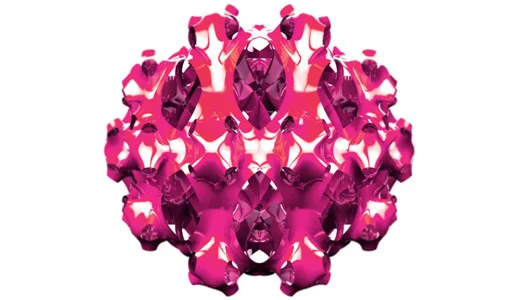
These stills are from Erick Carcamo’s phenomenal and terrifying final project for the Accumulative Micro Behaviors studio I taught with Hernan Diaz Alonso.
Phil Mana
Phil Mana’s exceptional final project for Accumulative Micro Behaviors engages themes of perversion and repetition.
Final Word
The final review for the studio I’m teaching with Hernan Diaz Alonso will be this Friday at Columbia. The critics include:
Jeff Kipnis
Francois Roche
Peter Cook
Preston Scott Cohen
Sanford Kwinter
David Ruy
Ferda Kolatan
Mark Gage
Mark Wigley
Should be interesting.
Random Selection
60% selection
40% Selection
Maya 8 has a built in random selection tool [ Select > Select Using Constraints > Random ] that works based on the percentage of selectable elements. You can continuously re-select and get some degree of controlled randomization — so cool.
Self Designing Systems
Looking through my old files I came across this early version of my last website. It is missing all of the content, but it shows the performance pretty well. I was trying to make a site that could constantly redesign itself based on certain parameters. The hexagon, which is wildly overused these days, seemed like a nice way to add a geometrical component into a random organization algorithm. There are a lot of subtle features built in that make the interface rather sophisticated. If you scroll over the hexagons they scale in proximity to the mouse. Clicking a hexagon causes the colors of every other hexagon to fade into a randomly selected new color. The buttons on the darker hexagon eventually became the navigation system for the whole site, but for now they just regenerate the system (you can also do this by pressing space). My friend Alex Mollere who is getting his Phd. in Mathematics figured out that there are approximately 36,000,000,000,000,000 possible graphic layouts for this site not including shifts in color.
Good Night on the Hudson River
I think I have to make this my new bio photo.
Carlos Miele Store
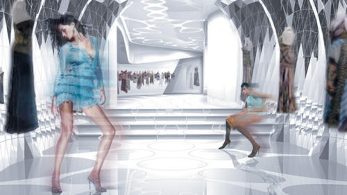
I just found this image of an early design I did for the Carlos Miele flagship store in an article about Asymptote in Metropolis. This scheme is far gone, but there were some interesting elements in there, notably the tessellated curtain of mirrors…and Gizelle.
Skin + Bones: Parallel Practices in Fashion and Architecture
The animation I directed for Archi-Tectonics will be playing at MOCA in Los Angeles in the Skin + Bones exhibition beginning 11.19.06.
Accumulative Micro Behaviors | Innovation and Novelty
Hernan Diaz Alonso and I are co-teaching Adavanced Studio V at Columbia. We’re adjusting our approach to what we’ve been researching over the last few years. All elements are now required to be 1” x 1” x 1” or less, forcing larger scale effects to emerge via hyperindexical accumulations.
Accumulative Micro Behaviors | Innovation and Novelty
Columbia GSAPP
Advanced Studio V
Fall 2006
Hernan Diaz Alonso and Alexander Pincus
Historically architecture always starts with a concept, an overall strategy or some kind of pre meaning. The studio proposes to re examine the possibilities of form generation as an autonomous entity.
Cutting Polygon Faces
Here is a MEL script I wrote that automates polygon face cutting. Its pretty self explanatory if you’re into this kind of thing. Click here to download.
Bloom 2.0
Bloom is a MEL script that produces variable, three dimensional topologies. By setting these variables to make random selections within a certain range, a sort of snowflake logic arises with intricate micro-scale variation within a coherent macro-scale formal language.
Breakin
I scanned a bunch of stills from a how to break dance poster I found in one of my old records to make this little animation. I’m using it as a placeholder on my website until I finish the new design. Given the way things are going lately that might be a while, so this will have to do for the time being.
Budapest Bank Tower
The Budapest Bank Tower we designed at Asymptote Architecture has won an international competition that included Zaha Hadid and Frank Gehry among others. The tower frames the view across the Danube in an industrial section that is being developed by the Orco Group (the competition organizers). The 30 story tower is designed to incorporate a second tower, to be constructed later, and is set to become the tallest building in Budapest.
The scheme is based on a single line that projects through multiple vectors and is given volume through a series of hyperbolic projections. The building is supported by a two rotating cores and a structural skin that we developed in collaboration with ARUP. The mesh skin is based on experiments we conducted with perforated topologies and aggregation, where a surface would become less perforated under heavier loads and more perforated under light loads.
PROJECT / IMAGE CREDIT »
Asymptote Architecture: Hani Rashid and Lise Anne Couture
Banff Session 2006: New Modes of Practice?
Via Canadian Architect, written by Ian Chodikoff:
This Year's Banff Session Allowed Practitioners From North America and Europe to Define the Methodology of Their Firms. the Issue of Landscape, Research, Sustainability and Rhetoric Were the Primary Issues That Were Both Defined and Defended.
Generally speaking, the 50th anniversary of the Banff Session was a huge success. And although most everyone was appreciative of the opportunity to spend a few days in Banff, some discussion is warranted on the modes of practice that were presented during the session. Beyond the wine and wild roses, one could not help but be disappointed with some of the approaches to practice being presented over the course of the event. While much of the work was challenging and inspirational, there was a considerable amount of empty rhetoric, overwrought pursuits of whimsical formal gestures and outdated diatribes on sustainability. Nonetheless, considerable attention was paid to new methods of approaching and discovering design questions relating to the landscape as well as the search for delight and invention within the urban sphere.
Former editor of Progressive Architecture and current Dean of the School of Architecture at the University of Minnesota, Thomas Fisher deftly and politely moderated several panel discussions involving, among other presenters: James Cutler of Cutler Anderson from Bainbridge Island, Washington; Marlon Blackwell from Fayetteville, Arkansas; PLANT Architect Inc. from Toronto; Thomas Heatherwick from London, England; and Alex Pincus, a stand-in for his employer Hani Rashid of Asymptote in New York. Fisher’s skills as a moderator are exemplary, and he set an agreeable tone for the 26th Banff Session. However, many questions remain which should be discussed so that Canadian architects may clearly understand the difference between empty formalism and the pursuit of invention and innovation in an approach to practice.
One notable firm that believes in pursuing critical and thought-provoking work is PLANT Architect from Toronto. Led by Lisa Rapoport, along with Christopher Pommer and Mary Tremaine, PLANT presented a design process that seeks to describe a new paradigm of landscape architecture and design that eschews the temptation to label their work as simply “landscape urbanism,” “hybridized design” and “multidisciplinary platforms of practice”–catchy phraseology that can mean just about anything. Comprised of both architects and landscape architects, PLANT’s approach to design was summarized through a series of very clear questions. What is it? What does it look like? What are all the pieces? How does it all go together? How is it being built? Being able to analyze the important elements on the site and appreciating their potential involves three important steps: observation, documentation and synthesis. The projects that Rapoport presented, spanning from the well-known Sweet Farm to studies for Meadowlands, New Jersey, all examine the importance of site in terms of physical, historical, spatial and cultural paradigms.
Beginning with their studies for the Meadowlands in New Jersey, PLANT was asked to develop a conceptual master plan for a 20,000-acre area across the Hudson River from Manhattan known as the Hackensack Meadows, a site that is crisscrossed by three municipalities and seven towns. The Meadowlands is a place to drive through on the way to New York or to the Ikea in New Jersey–not a place that inspires change and opportunity. Containing early examples of industrial occupation, parts of the site used to be oak forest, while other areas continue to remain difficult marshlands where consecutive attempts by both the Dutch and the US Army Corps of Engineers failed to dominate the landscape and build upon a difficult terrain. Through the development of several kinds of maps to analyze the rivers, bridges and industrial artifacts, PLANT developed conceptual models to see how the various spaces could be developed, and this process could be of significant inspiration to other designers who wish to work on such a large scale.
Another case study presented by PLANT included the Mtis Gardens project of 1999, which provided an exploration into the many aspects of contemporary garden-making. By walking through the site, the designers came across four mature Quaking aspen and decided to use them as an anchor point for their design concept. The synthesis behind their project involved creating a St. Lawrence landscape that allows visitors to discover the site in a state of repose. A chaise longue, domestic gardens, a bench made of stones collected on the shoreline, fabric screening and a large dividing element constructed of wood and loose straw together create a collage that introduces furniture as a physical manifestation of the landscape, and furthers the discussion surrounding the relationship of inhabitation.
But not every practitioner presented fresh insights into contemporary practice. One of the early disappointments during the session was architect James Cutler. Cutler started his practice in 1977 and as Bainbridge Island grew in population, so did the size and nature of the residences, as dot-com millionaires began populating this once idyllic Pacific Northwest enclave. Admitting that it is difficult to remain a steadfast tree-hugger while practicing as an architect, Cutler was determined to hang on to his vision of treading softly on the earth. But as the complexity of his commissions grew, he realized that he was part of the very machine that is the enemy of nature, and managed to come to terms with the fact that he was helping to destroy the very landscape that he set out to protect. When he was given the commission to design a 55,000-square-foot home for Bill Gates, Cutler believed that the project would provide him with a high-profile soapbox from which to espouse the ethics of designing sustainable architecture. On a somewhat positive note, the amount of old-growth timber required to construct the house necessitated the initiation of a sawmill designed specifically for the ongoing reclamation of old timber in the Pacific Northwest. Raising the issue of environmental sustainability for such a large home is not without its ethical dilemmas.
Although it is possible to appreciate other houses designed by Cutler, such at the Paulk Residence in Seabeck, Washington (1994) or the Long Residence on Orcas Island (2003), these projects are largely conventional homes befitting a special cadre of American elites who enjoy employing vast amounts of natural material in order to create lavish woodsy enclaves in old-growth forests and other environmentally sensitive areas. Cutler’s drawings are beautiful, often produced on vellum and shown with an old-fashioned slide projector, but nowhere do we see any advanced engineering that models energy-efficiency strategies. The projects merely exude that feel-good effect of using lots of wood. Cutler’s work may have been convincing to a professional audience 10 to 15 years ago, but in today’s world, these environmental mantras no longer seem relevant.
The work of Marlon Blackwell was also highly reflective of a desire to engage the dynamics of the region in which he works. The true value of Blackwell’s architecture is that it is born out of a goal of enriching the experience of the everyday. Blackwell’s approach is both fresh and dignified in that it seeks to engage the client in the process of making successful architecture that is tactile and responsive. Ranging from office buildings to single-family residences, Blackwell’s work empowers a local spirit and avoids any pretense of an architectural style. An excellent storyteller and a plain-spoken Southerner, he makes simple buildings elegant–an approach to practice that is both very straightforward yet difficult to emulate.
From an interest in the peculiarity of place, we turn to an architectural process that revels in producing facile and nearly unbuildable forms applied through socially dubious methods. In a delightfully arrogant and well-spoken manner, Alex Pincus was a credible, if not refreshing representative for Hani Rashid from the New York office of Asymptote. Armed with a recently acquired Master of Architecture degree from the paperless architecture school at Columbia–not to mention some professional initi
ation of obscure parlance from his former employer Peter Eisenman–Pincus was on message espousing Asymptote’s party line. Working at various scales, Asymptote produces investigations that range from products to skyscrapers, as well as attempting to engage in urban design. Somehow all the scales seem to share a common theme that is richly rhetorical while fetishizing the aspects of empty formalism.
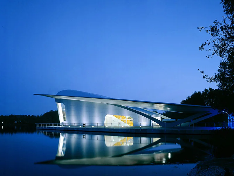
In 2002, Asymptote completed their Hydra Pier near Haarlemmeer, Holland which is their most successful built work. Containing very little program, the project was ostensibly intended to be an iconic building for a flower festival. Situated on reclaimed land near the Schiphol airport, the design process began with looking at the history of Holland when much of its land was under water 150 years ago. Therefore, Asymptote conducted a variety of formal studies looking at hydrodynamics and aircraft design. The fluid and undefined roof plane acknowledges the planar and artificial Dutch landscape while a triptych of curved glass wraps itself around the building opening to the landscape beyond. Pincus speaks of an ill-conceived irony that attempts to frame a landscape through the pavilion’s windows–ascribed to a Dutch landscape painting that is impossible to engage. This hint of irony is neither particularly interesting, nor effective. Framing a landscape through a window where one cannot directly engage the site is no more ironic than stating that a goldfish who swims in a fishbowl cannot engage the environment of the room in which the fishbowl is located.
And as far as operating within a fishbowl, it is puzzling how Asymptote managed to secure a commission to provide a master plan for Georgetown, an old historic colonial town located in Penang, Malaysia. The entire area has around 400,000 inhabitants, half of which occupy an historic centre comprised of Chinese shophouses and a sensitive urban fabric. If one were to actually visit Georgetown, one would be surprised to hear how Asymptote intends to develop a master plan that sets out to negate the town’s post-colonial expansion through the concept of “rails as building envelopes emanating from the hillside as fingers into the city.” With the intention to develop residences, offices, cultural and institutional buildings set against a park and road system, there appears to be no strategic planning behind the intended implementation of hotels, condos, a philharmonic hall, schools, sports arenas, public greens and medical facilities. Beyond naming just about every building type imaginable, Asymptote intends to develop indiscrete buildings that “conform to a three-dimensional blanketing of the site producing an undulation throughout the site and creating an envelope strategy for development.” Aren’t all buildings three-dimensional? In Asymptote’s fascination with form and virtual reality, urban design remains an afterthought that is questionable with respect to the existing social fabric and cultural sensibility of place.
And finally, it is Asymptote’s proposal for the Guadalajara Guggenheim that is the most spectacular example of the firm’s desire to produce an architecture of fantasy. As finalists for the museum competition, the project is not so much an icon, but a hybrid between the “organic and the machine.” The whole building is held together by a parametric structural system whose elements redefine their shape and connections intuitively based on a whimsical digital model sprung from a “megaplinth of culture.” As his night rendering illustrates, the virtual and real come together where Pincus closed by stating, “the spectacle and hybrid of the confluence of digital and real that makes Asymptote the undefined and unclear firm that we are at the moment.”
As a young practitioner with a sense of invention and delight, Thomas Heatherwick was truly a breath of fresh air. Heatherwick founded his firm in 1994, but it was the London Fashion Week installation at the Harvey Nichols department store in 1997 that first brought him attention. The project involved weaving a 200-metre-long structure through the department store’s 12 windows along its faade. Today, Heatherwick Studio comprises an office of 25 people, which include architects, landscape architects, product designers and engineers.
Heatherwick’s manner of speaking about particular design approaches is tinged with a sense of wonder and invention as exemplified by his Rolling Bridge, located on the Paddington Basin in London, perhaps his most published project to date. Another magical project is the “B of the Bang” sculpture completed in Manchester in 2004. At 56 metres in height, it is the UK’s tallest structure. Next to the stadium built for the 2002 Commonwealth Games, the sculpture forms a gateway to the stadium, and is constructed from 180 tapered steel spikes connected at a central point 22 metres above the ground. The structure is supported by five of the spikes that extend more than 20 metres below ground.
On an urban design level, Heatherwick’s scheme for Hong Kong’s Wan Chai district provides an elegant solution for a diverse range of recreational activities. It consists of three significant elements: a series of elevated basketball courts, a hard edge containing night markets and opportunities for sports activities, and finally a reconfigured soccer field that is lowered by 1.6 metres below grade and designed with stepped seating around the perimeter.
Working at a variety of scales–from designing handbags to urban design schemes–one of Heatherwick Studio’s interests lies in product and industrial design research. This has yielded projects like the 30-metre-tall glass bead structure for the Wellcome Trust in London, or the crinkled stainless steel modular panels made rigid with the spraying of CFC-free insulating foam on the back. The panels are to be used on Heatherwick’s Aberystwyth Business Units in Wales, a commission which was secured through a competition to design 20 business units and accompanying multipurpose space for Wales’ largest arts centre. Construction is due to begin in the summer of 2006.
In a very poignant manner, the Banff Session closed with Afghan-American artist Lida Abdul delivering a thought-provoking presentation relating her interpretations of life near Kabul and in Los Angeles. Abdul provided a glimpse of some of the issues that our profession will increasingly find itself addressing in the years to come, notably how to contend with populations living in a global diaspora as well as the responsibility of Western culture and Western cities to connect with what is happening beyond our borders. Her work included videos of her carrying around an idealized vision of inhabitation–a little girl’s dollhouse–throughout the neighbourhoods of Los Angeles. Her main body of work focused on the destruction of houses and villages in Afghanistan and how this destruction had inspired her to seek some means of healing by covering ruins of homes in white paint. The paint represents hope, memorialization and healing. Architects could do well by beginning to understand how we can design through modest means and spiritual depth for a world that is placing increasingly greater demands on the design community to respond to the complexities of our global cultures. Although based in a theoretical context, Abdul is a critically engaged artist who has lived as an Afghan refugee and continues to be in contact with many other Afghan refugees who consider “architecture as a place of hiding, as refuge, as target.” Abdul remarked to me in conversation that she just wanted to give a different perspective on what is going on in today’s global reality, and to perhaps inspire some architects to think of these informal and weak places as well as the many fragile socio-political situations that our world must face.
As Fisher articulated in his desire to bring together the many presenters over the course of the three-day conference, the issue of landscape was a common thread. Blackwell and Cutler exemplified a cultural landscape while PLANT emphasized the natural landscape. Practitioners like Pincus reside in the virtual landscape, while Heatherwick believes in innovation and discovery largely in the urban landscape. At one point, Fisher asked Pincus to defend rather than define his position on buildings that do not consider a sense of place. Pincus merely responded that, “place is a completely constructed concept and the world as we see it is constructed by our own minds. Architecture is by its very nature, alien environments.” Thankfully, most architects would disagree. As the 2006 Banff Session indicated, our world is a very dynamic place that, according to Heatherwick, is full of “particularities.” We should all be so lucky to design in a world full of diverse opportuities and futures.
PINC.US V1
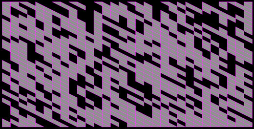
These screenshots show variations of the original version of this website. The idea was to produce a site that constantly designed itself. Based on geometric relationships, randomization, and automated color selection, it produced billions of unique layouts, allowing chance to play a greater part in the design process.
Tower Concept Model
This three pronged, torqued form is the beginning of our explorations for a tower we are designing for a massive development in Abu Dhabi.
PROJECT / IMAGE CREDIT »
Asymptote Architecture: Hani Rashid and Lise Anne Couture
Alex Ebert Applause
This is my friend Alex Ebert. He was in New York for the summer recording vocals for his band IMA ROBOT. We drank a lot of wine and put together this website photocollage of a performance art piece he did in LA. It’s LA so its not really art, but there’s something about it that works for me. I think there was supposed to be some music but I can’t find that part.
Spiky Shiny
This is an example of a shape made using the bloom MEL script that I wrote recently.
Bloom
This is a form produced using Bloom, a MEL script I’ve been writing that creates blossoming topologies in Maya. Download the Bloom MEL script.
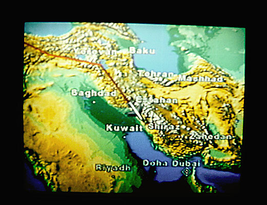
Baghdad
I might have chosen a different flight path.

